


Upcoming show at Stanford Art Spaces

May 31st to Aug 8th, 2013
on Stanford Campus in the Paul Allen Building. there will be an opening Friday July 12th 5pm-7pm.
15 paintings are going up next week.
http://cis.stanford.edu/~marigros/show89.html#work2
Paris Photo- Paramount backlot
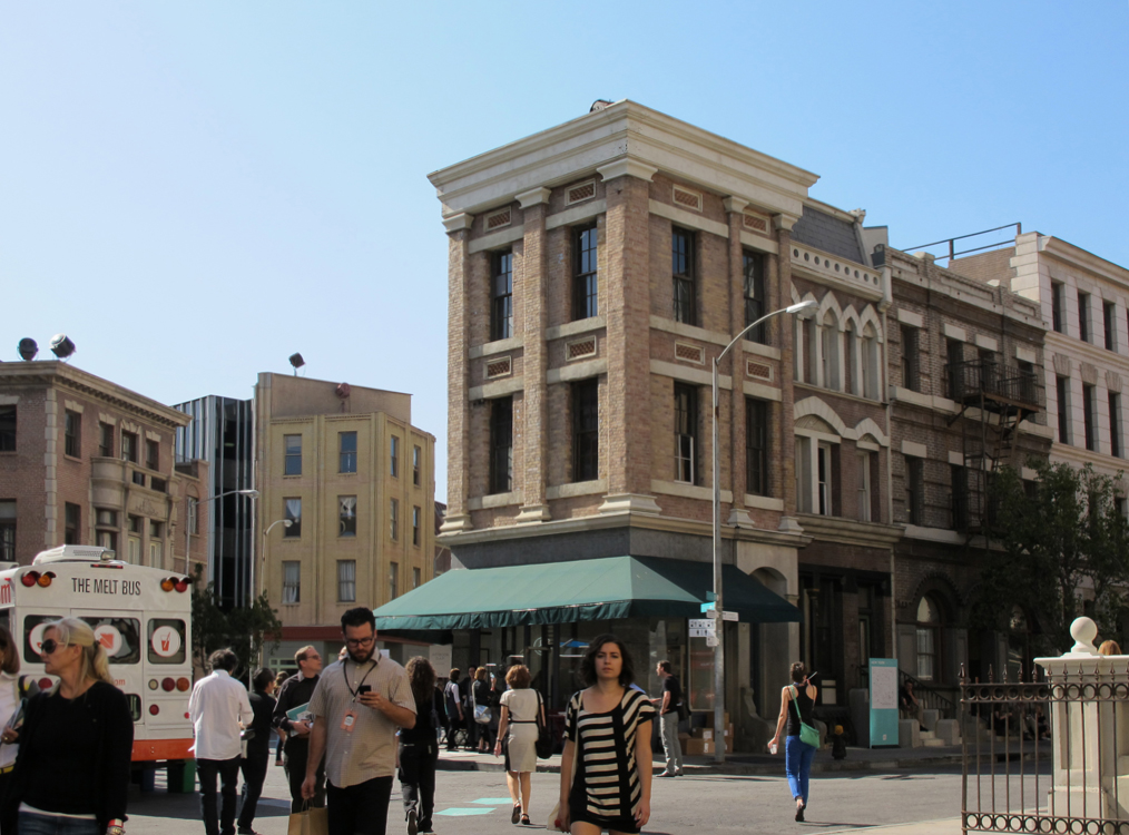 hey it’s New York! great show, the japanese photographers seemed to rule the day
Blue Whale show
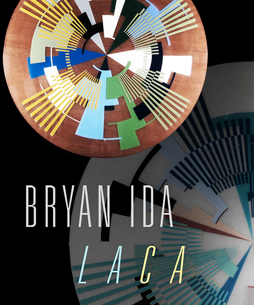
BlueWhale + Cafemode present
BRYAN IDA
“LACA”
curated by Kio Griffith
on view > MARCH 11 to MAY 31, 2013
ARTIST RECEPTION: APRIL 17, 2013 from 7pm to midnight
FREE ADMISSION BEFORE 9PM
$10 AFTER 9PM for Music
featuring
ADAM RATNER guitar
LARRY GOLDINGS keys
LOUIS COLE drums
BLUEWHALE
123 Astronaut E S Onizuka Street #301 Los Angeles, CA 90012
Weller Court Plaza 3rd Floor
live cutting-edge jazz + artist installations
from 8pm to 2am [Mon-Sat] closed Sundays
_________________________________________________________________
BlueWhale + Cafemode proudly present “LACA” by BRYAN IDA
Bryan Ida’s “LACA” is the second artists’ installation series at BlueWhale.
Artist Statement
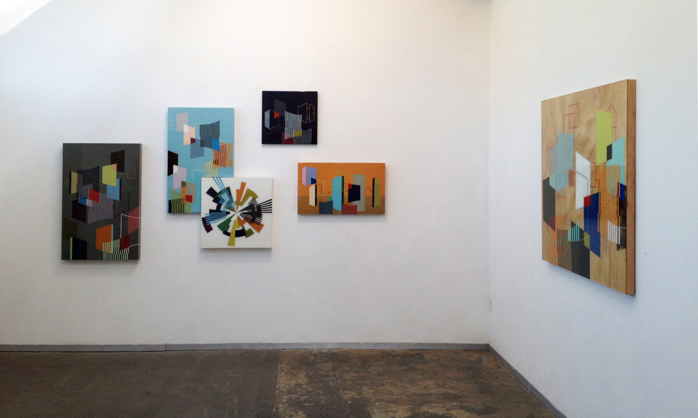
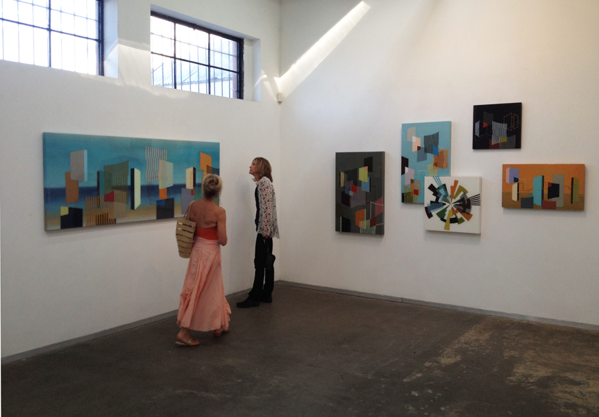
In my latest series I wanted to capture the feelings of location and identity with an emphasis on the unique architectural history of Southern California. I reflect the relationships formed within the region between all its divergent cities and communities. I wanted to somehow express the complexity, diversity, and beauty of the region we live in as well as the sense of time that is felt as the city experiences its decay.
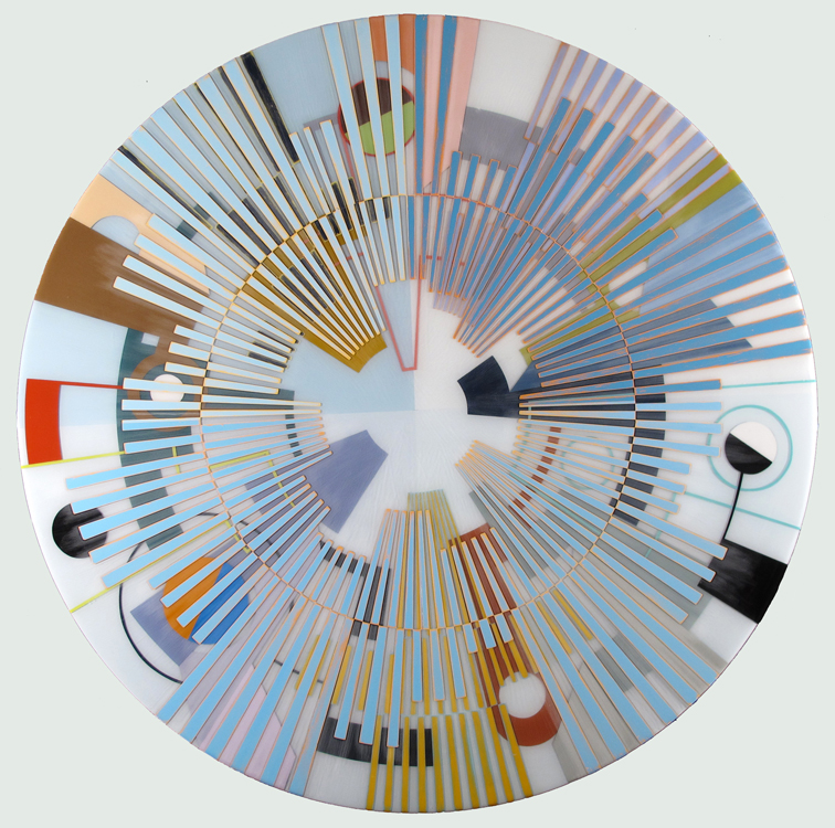
This new series of paintings uses round and rectangular shaped panels to explore, interpret and express the energy and flow of this thought process. The round panels are mandalas. These come from the perspective of looking straight up from a city street and seeing the tall buildings converge on a central point. The focal point is the center of the mandala. This viewpoint leads into abstraction as one loses their point of reference, everything turns on itself and the beginning becomes the end
The rectangles are more traditional landscapes with a view from the horizontal perspective where one can see a horizon line and the outlines and forms of buildings that identify a city. The foreground composition consists of colors and forms inspired by short glances, impressions, and photographs of architecture in the Southern California area. I try to contrast the idea of a fleeting unbalanced glance with the balance achieved in stasis.
I use negative space behind the forms to tell as much of the story as possible. The use of negative space for me is about finding a place to fit in; the relationship between what is there and what is not. It speaks of location. The composition is a balance between the negative space in the back and the forms and outlines in the foreground.
To complement these compositions, I’ve developed a technique that layers paint inside thick layers of epoxy, essentially isolating each layer from one another. This physical separation gives a sense of depth, volume and detachment again echoing the city theme.
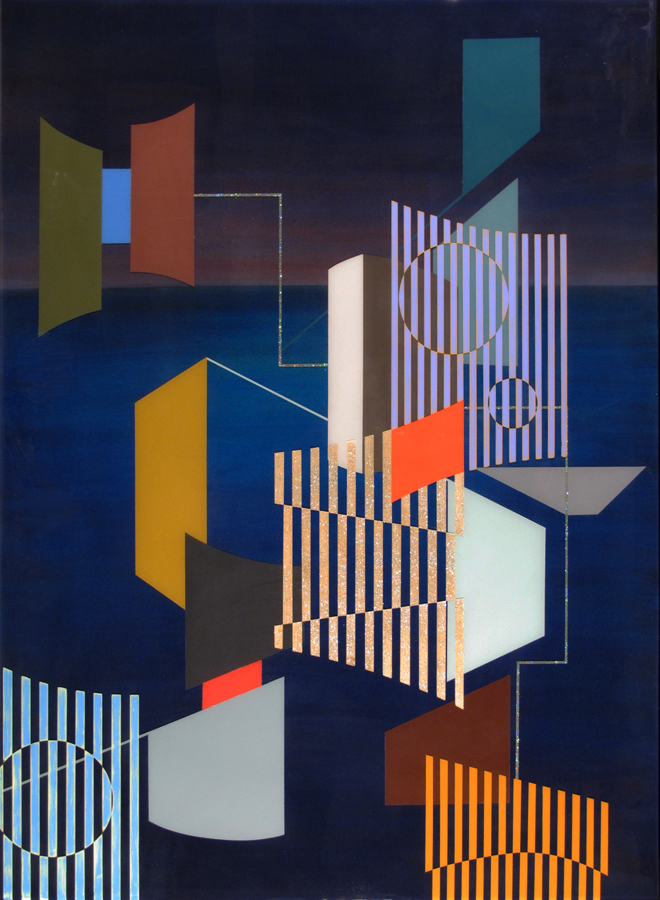
“Venice at Night”

the background is a deep blue, magenta. about 40 layers. trying to capture the richness of the night with the glow of the sun barely there
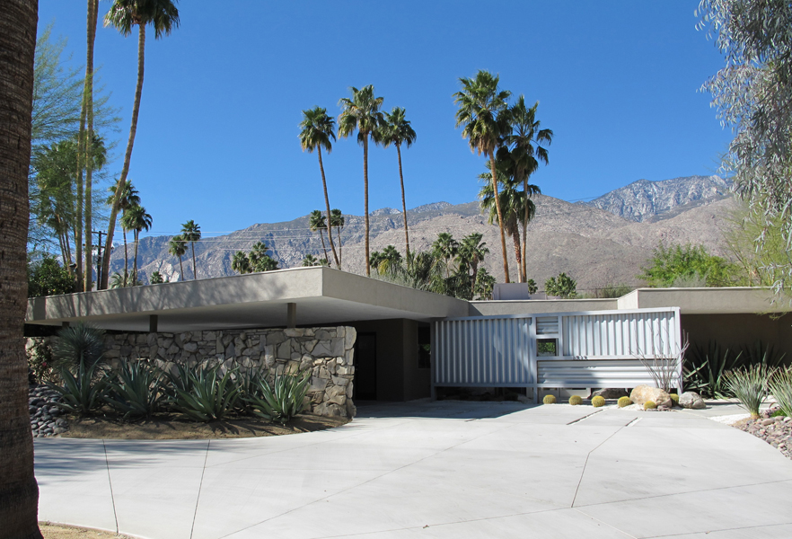

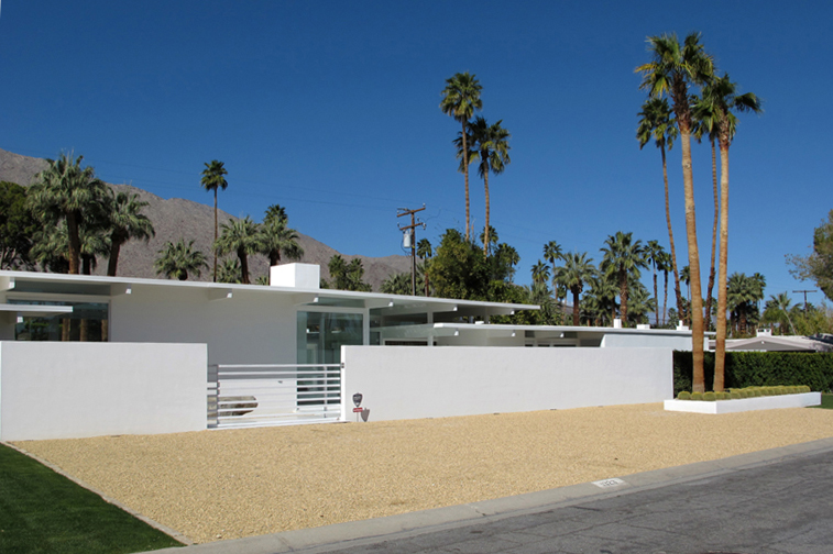
cantilever house

that roofline is great. the house looks like blocks stacked together into a cohesive whole. i like the idea of deconstructing this

“Twin Palms”

Twin Palms is one of the early mid century modern developments in palm springs. the background fades are 30 to 40 layers of acrylic to create the seamless blend.


Palm Springs
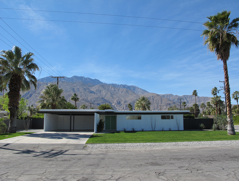
Went to palm springs to check out some of the architecture and shoot some photos for reference. I wanted to emphasize some of the earlier tracts and their idea of creating affordable yet stunning houses. all about the lines. simplicity.

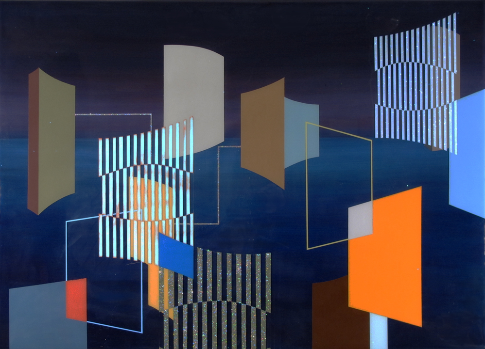
Finished with the painting part
ive been painting solid for six weeks. i wanted to have 5 more pieces to select from.
this one is called “Santa Monica. The show is about impressions, taken from glances, of areas I have spent time in and around southern california.
“


September 8th Show
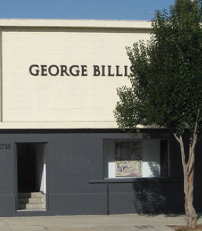
I should have about 18 new pieces done before the show opens. i have 11 done right now

